Category Archives: 2010
New Logo for pixprin
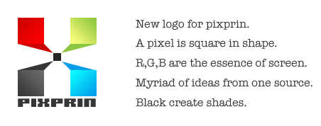
Things are continue to change with time so we are , designs, nature etc. I’ve designed a new logo for PIXPRIN, yes thats my own and for my website. I’m also planning to renovate the website too, as soon as I get ample time I’ll start it. This post lets you see and understand the logo I’ve created. It doesn’t has smooth corners rather composed of sharp edges and corners as denoting a pixel’s physique 😉 just like Michael jackson’s crisp locks and pops. The typeface chosen below is a pixel font which is very near to the concept of logo.
The particular design I’ve clicked after lot of sketches and doodles. The essence the logo has described at right of its side. 🙂
New HDR experiments
I’m kinda novice in HDR imaging..gained some inspiration from you(studiophototrope). Your works are amazing dude..
original images downloaded from o2-photos.


